How to Set a Pivot Table: Quick Steps
You are staring at a massive spreadsheet full of sales numbers, customer names, and dates. The data holds valuable insights, but making sense of it feels impossible. That is where pivot tables become essential. A pivot table is one of Excel’s most powerful tools for summarizing, analyzing, and exploring large datasets without writing complex formulas. Learning how to set a pivot table transforms raw data into actionable intelligence in seconds.
Setting a pivot table involves more than dragging fields around. It starts with clean data, proper structure, and smart customization. In this guide, you will learn step-by-step how to create, customize, and maintain a pivot table that adapts to your needs. From initial setup to advanced filtering with slicers and timelines, every stage helps you extract maximum value from your data quickly and accurately.
Prepare Your Source Data for Pivot Tables
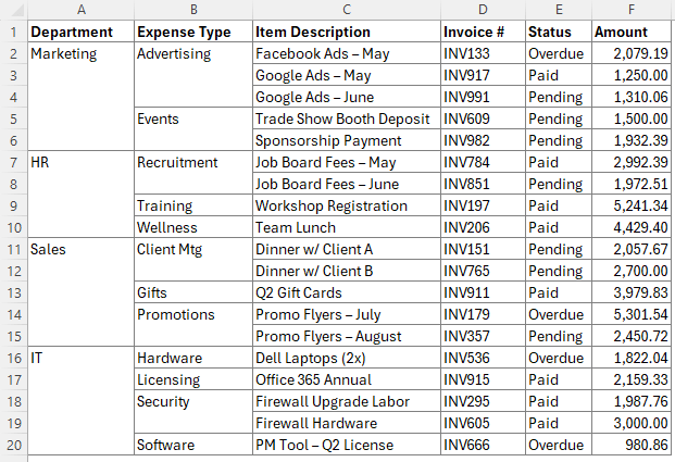
Before creating a pivot table, ensure your data meets structural requirements. Poor source data produces poor results, and no pivot table can fix messy information.
Use a Tabular Layout
Structure your dataset like a database by following these rules:
• Use one header row only, with unique and descriptive labels like “Sales Amount” instead of vague terms like “Rev”
• Include no blank rows or columns within the data range, as these break continuity and cause errors
• Avoid merged cells, which prevent proper field recognition in the pivot table
• Keep a single category per column and avoid repeating month columns like Jan, Feb, and March stacked horizontally
Format Data Types Correctly
Consistent formatting ensures accurate calculations in your pivot table:
• Format numbers as Number, Currency, or Accounting for proper mathematical operations
• Use Excel’s date format for date fields to enable grouping by month, quarter, or year
• Ensure text fields avoid mixed content such as numbers stored as text
Convert to Excel Table
Making your data source dynamic takes extra work upfront but saves time later:
- Select any cell in the data range
- Press Ctrl + T on Windows or Cmd + T on Mac
- Confirm the range and check the box labeled “My table has headers”
- Name the table under Table Design by clicking Table Name and typing a descriptive name like “SalesData”
New rows added below the table are automatically included when you refresh the pivot table.
Insert a Pivot Table in Excel
With your data prepared, you can now build the pivot table using one of several methods.
Choose Your Creation Method
Three main approaches exist for creating pivot tables in Excel.
Manual Insert Method
This recommended approach gives you full control:
- Click inside your Excel Table or highlight your data range
- Go to Insert and click PivotTable
- In the dialog box, confirm the Table or Range field shows your data
- Select New Worksheet to keep your original data safe
- Click OK
A blank pivot area appears with the PivotTable Fields pane on the right side of your screen.
Use Recommended PivotTables
For instant insights without manual setup:
• Go to Insert and click Recommended PivotTables
• Excel analyzes your data and displays several summary layout options
• Select the layout that matches your needs and click OK
Try Analyze Data Feature
Excel offers AI-powered assistance for natural language queries:
• Select your data range and click Home followed by Analyze Data
• Type a question like “Which salesperson has the highest total sales?”
• Excel generates a pivot table and chart instantly
Keyboard Shortcuts for Speed
These shortcuts help you create pivot tables faster:
• Windows: Press Alt + N + V to open the Create PivotTable dialog
• Mac: Press Cmd + Option + P
• Toggle Field List on Windows: Press Alt, then J, then T, then F
Build Your Pivot Table Layout

The PivotTable Fields pane serves as your control center for organizing analysis.
Drag Fields to Drop Zones
The pane contains four key areas where you place fields:
Filters
Drag fields here to apply global filters across your entire report. For example, dragging “Product” to Filters creates a dropdown at the top letting you view data for specific products only.
Columns
Place fields here to display values horizontally. Dragging “Region” to Columns creates a separate column for each region like East, West, North, and South.
Rows
Use this area to list items vertically. Dragging “Salesperson” to Rows displays each person as a row label. Adding a second field below creates subcategories under each primary item.
Values
This area shows your summarized results. Dragging “Sales Amount” here defaults to Sum. Dragging “Order ID” defaults to Count, showing the number of orders rather than totals.
To determine which salesperson generated the most revenue, drag Salesperson to Rows and Sales Amount to Values. The result shows each person with their total revenue summed, revealing who performed best.
Customize Pivot Table Calculations
Go beyond basic sums by tailoring aggregations and creating derived metrics.
Change Summary Function
Modify how Excel calculates your data:
- Right-click any value in the Values area
- Select Summarize Values By
- Choose from Sum, Count, Average, Max, Min, or Product
Changing Sales Amount to Max reveals the largest single order. Changing Order ID to Count shows how many orders exist for each category.
Show Values As Percentages
Display relative performance instead of raw numbers:
- Right-click a value in the pivot table
- Select Show Values As
- Choose % of Column Total or other percentage options
- Double-click the field header to rename it descriptively
This approach might show that one salesperson accounts for approximately 25% of total revenue.
Create Calculated Fields
Add new metrics that do not exist in your source data:
- Click PivotTable Analyze on the ribbon
- Select Fields, Items & Sets, then Calculated Field
- Name your new field like “Profit Margin”
- Enter your formula such as = Revenue – Cost
- Click Add and then OK
The new field appears in the field list and can be dragged to Values like any other field.
Sort and Reorder Data
Organize results for better insights:
• Click the dropdown on Row Labels to sort A to Z or Z to A
• Use More Sort Options for custom arrangements
• Right-click any item and select Move to reposition it manually
Analyze Data with Multi-Dimensional Pivot Tables
Pivot tables excel at analyzing data across multiple variables using layout flexibility.
Create Cross-Tab Reports
Build matrix-style reports showing relationships between categories:
• Place Customer in Rows and Product in Columns
• Add Sales Amount to Values
• Each cell displays total sales for that specific customer-product combination
Use Hierarchical Grouping
Organize data in layers for easier navigation:
• Drag Region above Salesperson in the Rows area
• Click the plus and minus buttons to expand or collapse regions
• Drag fields up and down in the Rows box to change the hierarchy
Apply Filters to Focus Analysis
Narrow your view to specific data points:
• Use Filter area dropdowns to select particular items
• Filter by Product to see performance for one category only
• Choose All or drag the field out of Filters to reset
Filtering to “Chocolate Chip” might reveal that Eve sold the most in that specific category.
Group Dates and Numbers
Aggregate granular data into meaningful periods:
• Right-click a date in the pivot table and select Group
• Choose Months, Quarters, Years, or combinations
• For numeric ranges, set intervals like 0 to 100 or 101 to 200
Grouping sales by quarter helps identify seasonal trends throughout the year.
Add Visual Enhancements to Pivot Tables
Transform static summaries into interactive dashboards with visual tools.
Apply PivotTable Styles
Improve readability through built-in styling:
• Go to Design on the ribbon
• Select PivotTable Styles
• Choose banded rows or color themes that match your preferences
Adjust Layout Settings
Fine-tune how your report appears:
• Report Layout offers Compact Form for saving space, Outline Form with indented subtotals, or Tabular Form best for copying to other documents
• Grand Totals and Subtotals can be turned off if not needed through the Design tab
Insert Pivot Charts
Visualize trends instantly by adding charts:
- Click inside your pivot table
- Press Alt + F1 for a quick chart or go to Insert and choose Charts
- Select bar, column, or line chart based on your data type
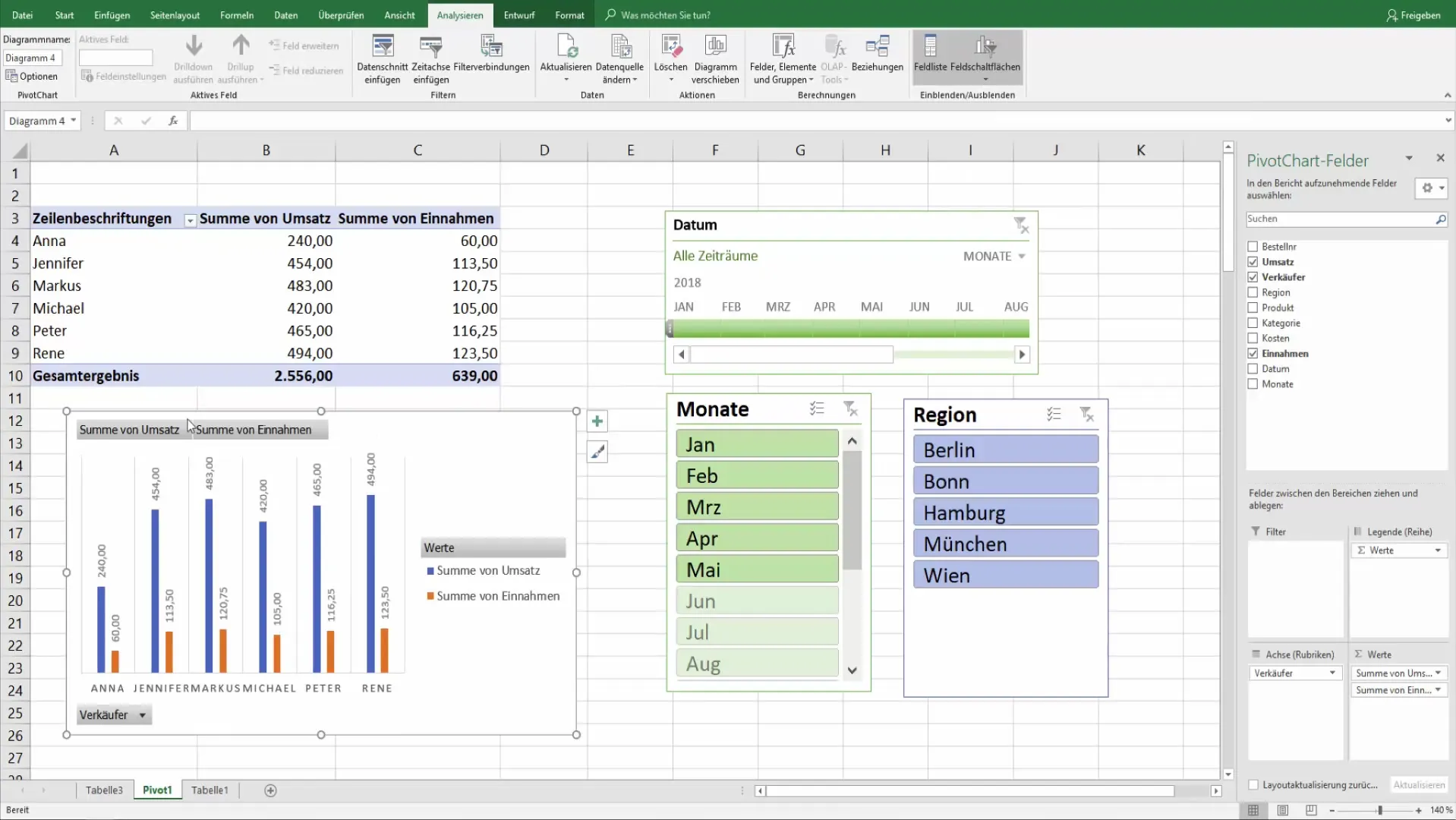
The chart dynamically updates when you change the pivot table layout.
Add Slicers for Click-Based Filtering
Create interactive buttons perfect for dashboards:
- Select your pivot table
- Go to PivotTable Analyze and click Insert Slicer
- Choose fields like Region, Product, or Salesperson
- Click buttons to filter instantly
Hold Ctrl to select multiple items. Click the Clear Filter icon to reset.
Insert Timelines for Date Ranges
Filter by time visually using slider interfaces:
- Click PivotTable Analyze and select Insert Timeline
- Choose your date field
- Drag slider handles to pick periods like Q1 2023
Timelines work only with date-formatted fields and excel at monthly or quarterly reporting.
Refresh and Maintain Your Pivot Table
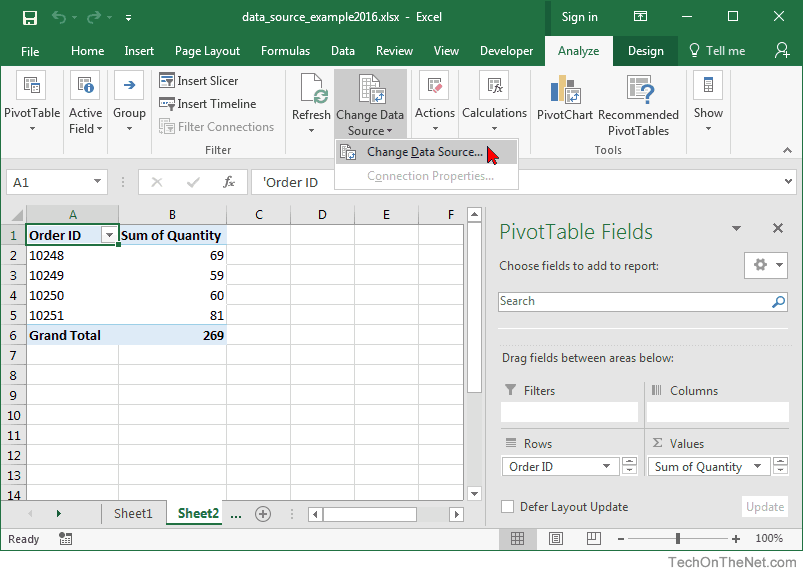
Pivot tables do not update automatically, so regular maintenance keeps your data accurate.
Refresh After Data Changes
Always refresh when source data changes:
• Click inside the pivot table and go to PivotTable Analyze
• Click Refresh or right-click and select Refresh
• New entries like Customer #6 will not appear without this step
Handle Source Range Expansion
Your approach depends on how your source is structured:
• Excel Tables automatically include new rows after refresh
• Static ranges require manual adjustment through PivotTable Analyze and Change Data Source
Verify Accuracy
Test your results against known values:
• Compare pivot totals to manual SUMIF or COUNTIF formulas
• A pivot showing $521,000 across 92 orders can be verified with a simple formula
• This step catches errors before they影响 decisions
Frequently Asked Questions About Setting Pivot Tables
What is the fastest way to create a pivot table in Excel?
The quickest method uses the Recommended PivotTables feature. Go to Insert, click Recommended PivotTables, and select a pre-built layout that matches your analysis needs. For full control, press Alt + N + V on Windows or Cmd + Option + P on Mac to open the Create PivotTable dialog.
Why does my pivot table not include all my data?
This problem usually occurs because of blank rows or columns in your source data. Clean your data by removing empty rows within the range and ensuring every column has a header. Convert your data to an Excel Table using Ctrl + T to prevent this issue in the future.
Can I create a pivot table from data on different worksheets?
Yes. When creating a pivot table, select the option to use external data sources or manually select ranges from multiple worksheets. However, keeping all source data in one location produces more reliable results and simpler maintenance.
How do I update a pivot table when I add new data?
Click inside the pivot table, go to PivotTable Analyze, and click Refresh. If your source is an Excel Table, new rows automatically appear after refresh. For static ranges, use Change Data Source to include the expanded range.
What is the difference between a pivot table and a pivot chart?
A pivot table displays data in tabular format with rows and columns. A pivot chart provides visual representation of that same data. Pivot charts automatically update when you modify the underlying pivot table, making them ideal for presentations.
Can I use pivot tables with data from other programs like CSV files?
Yes. Import or open data from other programs, then ensure it is properly formatted in Excel before creating your pivot table. Clean the data to remove formatting issues from imported files, then proceed with the standard pivot table creation process.
Key Takeaways for Setting Pivot Tables in Excel
Mastering how to set a pivot table transforms you from a data entry clerk into a data analyst capable of extracting insights from complex datasets. The process begins with clean, tabular source data using one header row per column with no blank rows or merged cells. Converting your data to an Excel Table ensures automatic expansion when new rows are added, eliminating manual source updates.
Building the pivot table involves dragging fields to the appropriate zones in the PivotTable Fields pane. Place fields in Rows for vertical lists, Columns for horizontal categories, Values for calculations, and Filters for global restrictions. Customize calculations by changing summary functions, showing values as percentages, or creating calculated fields for metrics not present in your source data.
Enhance reports with visual elements like PivotTable Styles for better readability, Pivot Charts for trend visualization, Slicers for interactive button-based filtering, and Timelines for date range selection. Finally, remember to refresh your pivot table whenever source data changes to maintain accurate reporting. With clean source data, the right layout, and smart enhancements like slicers and calculated fields, you can explore complex datasets interactively without writing any code.